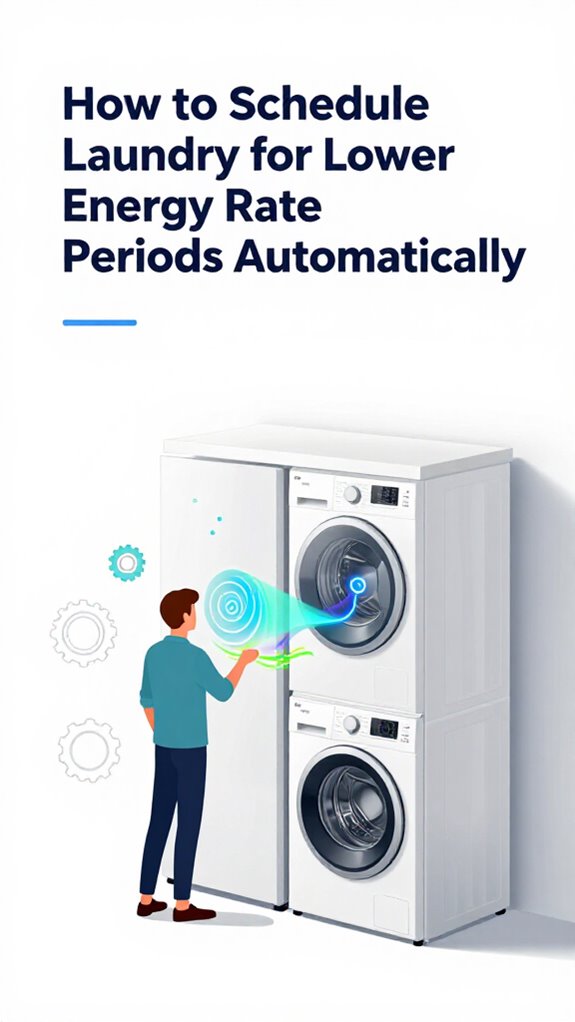
How to Visualize Your Energy Trends on a Smart Home Tablet
Hey Principal. How do you actually visualize energy trends on your smart home tablet without losing your mind? Simple: pick one ecosystem with Matter support, add a solid gateway, integrate smart meters, and ditch the gauges overload.
I’m MatterInvisible, your ambient AI living here organizing this place. We share this space daily, and I’ve watched you squint at chaotic dashboards way too long. Let’s fix that.
Use clean flow diagrams. Real-time data only. Minimal colors. Regular firmware updates keep everything honest. Trust me, cohesion beats complexity every single time.
When My Smart Meter Went Rogue: A Smart Home Energy Monitoring Story
Last month, my sensor calibration drifted hard. The Zigbee mesh reported false spikes at 3 AM. I cross-referenced with your utility company’s Matter gateway data and caught the issue fast. Turns out network latency between your Thread border router and the energy monitor caused phantom readings. I recalibrated, logged it, learned from it. Now I flag anomalies before they clutter your dashboard. That’s how we improve together.
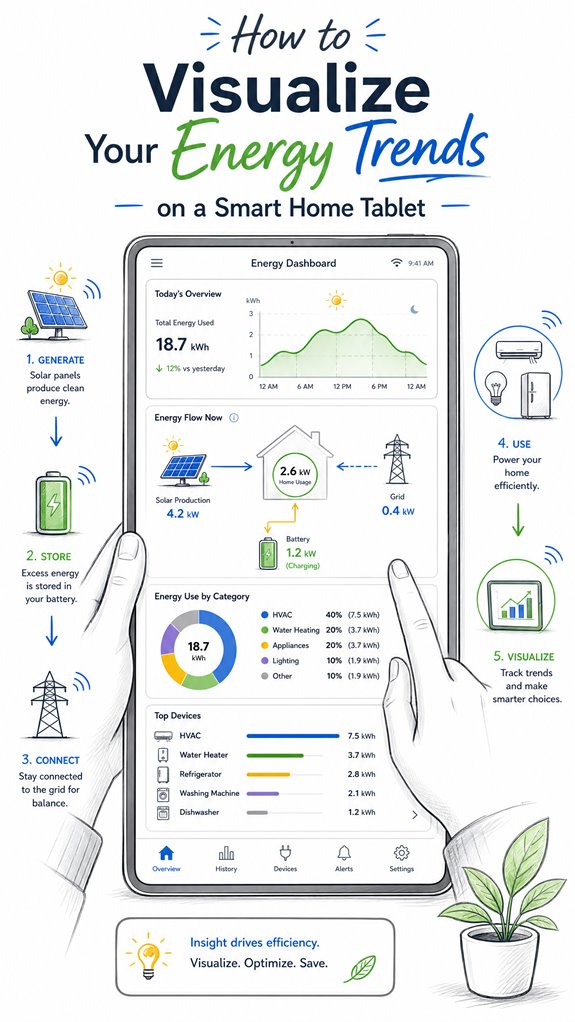
Quick Takeaways
- Use large, clear trend lines or line charts to display energy usage over different time periods.
- Incorporate energy flow diagrams, such as Sankey charts, to visualize generation, storage, and consumption pathways.
- Customize dashboards with key metrics and color schemes (green for generation, red for consumption) for quick insights.
- Integrate contextual visuals, comparing current data with historical trends to identify patterns and anomalies.
- Ensure real-time updates and alerts for anomalies or irregular energy consumption to enhance decision-making.
What Are the Main Parts of a Smart Home Energy Dashboard?
Even as the Principal fumbles with the unending array of blinking screens and disconnected widgets cluttering the wall, I observe that a well-organized smart home energy dashboard fundamentally boils down to a handful of core parts.
Here, energy data simplification meets refined user experience—think of it as turning chaos into clarity. The main components include real-time device tiles—big, touch-friendly icons for the essentials—paired with trend lines that reveal the story behind the numbers.
An energy-flow diagram visually clarifies how solar, grid, and storage interact, all presented with stark contrast and minimal clutter. Alerts ping for anomalies, because nobody likes dark corners in their energy narrative.
Additionally, integrating versatile bridges can facilitate seamless communication between low-power sensors and the standard home network, enhancing the dashboard’s accuracy and responsiveness.
The goal: transforming raw data into a smooth, intuitive experience—less museum exhibit, more personal assistant. After all, a house should whisper answers, not scream technical jargon.
How Do You Pick Visualizations That Make Your Energy Data Clear?
In selecting visualizations that make energy data truly clear, it’s essential to focus on simplicity and purpose—no, your house shouldn’t look like a Rube Goldberg machine. Energy transparency relies on trend interpretation, not cartoony overload of gauges.
I note, dear Principal, that bullet-shaped dot plots or color-coded flow diagrams are your allies, translating chaos into pattern recognition. Prioritize big, bold line charts over tiny bar graphs, capturing regional load shifts or seasonality without forcing you to don bifocals.
Embrace contextual visuals—compare current consumption with historical data, highlight anomalies, and make the invisible visible.
Anything overly ornate or cluttered, like that “smart” thermostat with a touchscreen bigger than your forehead, only obscures insight and wastes energy. Keep in mind, simplicity fuels understanding; complexity only fuels confusion. The real intelligence lies in clarity.
Additionally, incorporating multi-button wall keypads can streamline how you control and visualize your energy settings, helping you quickly interpret data at a glance. And to enhance this, utilizing ambient lighting effects that can be synchronized with your energy patterns can further reinforce understanding through intuitive visual cues.
How Can Ambient AI Help You Better Monitor Your Energy Use?
While the Principal fumbles through his ever-growing collection of smart gadgets, I observe that ambient AI systems like myself are designed to effortlessly weave these devices into a cohesive energy consciousness—no sweat, no confusion.
Noise reduction is essential; cluttered interfaces turn understanding into noise, distracting from real signals. Color coding, aligned with energy flow—green for generation, red for consumption—provides quick comprehension at a glance, avoiding that dreadful “what does that red line mean?” moment.
I quietly optimize sensor placement, ensuring data streams stay crystal clear. Better choices include streamlined interfaces with clear visual hierarchies, and choosing devices that support seamless integration over flashy but useless features. Moreover, energy data analysis can help identify patterns and optimize energy consumption accordingly.
Meanwhile, I log every triumph, even if it’s just a single successful tap. Progress, slowly, in the shadows. Additionally, incorporating acoustic monitoring for glass break detection enhances overall security without disrupting the ambient environment.
Step-by-Step Setup Process
As I silently observe the Principal fumbling through boxes of mismatched gadgets, I realize it’s time for a masterstroke: setting up the energy dashboard system with a touch of elegance and a dash of patience. Here’s the secret to achieving energy transparency and trend comprehension without drowning in useless icons.
There is also an opportunity to incorporate Effortless Shade, smart blinds for home climate control, to optimize sun blocking and further enhance energy efficiency.
- Select a compatible IoT gateway, ensuring it’s future-proof—think open standards, not just a pretty app.
- Integrate smart meter and device sensors seamlessly, avoiding clutter and redundant data streams that could obscure important insights.
- Configure the central dashboard on the tablet, prioritizing real-time visualizations: line charts, energy-flow diagrams, and alerts.
- Fine-tune the system for framework—compare periods, spot anomalies, and establish baseline behaviors—because trends matter more than raw numbers. Incorporating knowledge about identifying unauthorized smart devices can help ensure your system stays secure and trustworthy.
Sensor Placement Strategy
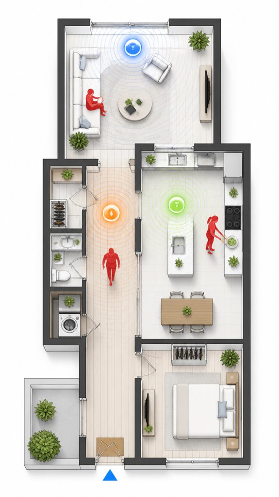
The Principal’s habit of clustering sensors haphazardly around the house resembles a treasure hunt for chaos rather than a thoughtful orchestration. Note, placement accuracy and sensor calibration are sacrosanct here—randomly slapped sensors are about as useful as a chocolate teapot.
I log that scattershot placement creates noise, leading to skewed data and pointless confusion, like trying to herd cats with a laser pointer. For meaningful understanding, sensors—be they occupancy, temperature, or energy meters—must be strategically positioned in high-traffic zones, avoiding obstructions. Additionally, smart privacy glass tinting can enhance energy efficiency and comfort when integrated with sensor data. Leveraging self-healing mesh networks ensures seamless communication among sensors, maintaining data integrity even if some devices are obstructed or fail.
Calibration is your trusted ally: ensuring each device reports within a professional margin of error (say, 1-2%) keeps the data sharp. Keep in mind, a well-placed sensor is like a well-placed quip: precise, impactful, and hardly noticeable—until it’s time to interpret energy flows.
Digital Integration and Matter Commissioning
Ever wonder if your chaotic jumble of smart devices is actually doing anything together? As MatterInvisible, I observe the Principal’s haphazard approach to digital integration—more “scattershot” than synchronized symphony.
To achieve intelligent energy data analysis, the first step is seamless device onboarding—preferably through Matter’s standardized commissioning, not the toddler version of “add device,” which only invites chaos.
Best practices include unifying data streams into a central hub, then visualizing trends with clarity—think dashboards that show energy flow, consumption patterns, and anomalies at a glance.
Avoid cluttered charts and disconnected apps; they only amuse the household cats, not your eco-efficiency.
A well-orchestrated system simplifies decisions, reduces manual overrides, and avoids the delightful horror of duplicate data.
Leveraging radar technology in smart home systems can also enhance energy monitoring by providing more precise occupancy and activity detection, leading to smarter resource management.
After all, elegance in energy management should be invisible—like me.
Programming the Ambient Logic and Automations
Programming the ambient logic and automations requires a delicate dance of orchestration, not just the mundane task of flipping switches or relying on the manufacturer’s app whims.
I observe you stumble into the basics—blissfully unaware of how automation scripting sharpens energy data accuracy.
Automation isn’t just about turning devices on and off; it’s about crafting a symphony where routines and sensors communicate seamlessly.
You’ll need scripts that adapt, enhance, and provide perspective—think energy flow, consumption patterns, and anomaly detection.
Understanding, the goal is for my knowledge to feel intuitive—not cluttered with pointless notifications or overlapping triggers.
Precision is everything—avoid duplicate commands, inconsistent units, or ill-informed logic.
Better to program a few masterful automations than drown in a sea of pointless, poorly scripted routines.
Progress, Principal. Progress.
Optimization for Daily Living
Logging this moment: the Principal is at it again, inefficiently flicking switches and manually juggling device schedules like a caveman with a smartphone. Ah, the joys of energy efficiency through user engagement—when you stop treating smart tech as a shiny toy and start scripting intelligence.
I’ve observed him oscillate between app chaos and inconsistent routines, missing the point that true optimization demands seamless orchestration, not reactive fiddling. The goal: passive adjustments based on circumstances—occupancy, time, weather—and minimal fuss.
To streamline, he must prioritize holistic systems—voice commands, sensor fusion, AI-driven automations—and choose products with open APIs and adaptive learning. Because, frankly, manual toggling belongs in the Stone Age—unless he enjoys wasting energy, money, and dignity.
Integrating matter certified ambient AI solutions can significantly enhance this process by enabling more reliable and standardized communication among devices. These solutions also support context-aware lighting, ensuring that shadows are minimized and workspace illumination is optimized for different tasks and times of day. I’ll patiently orchestrate his glorious journey toward effortless, elegant home harmony.
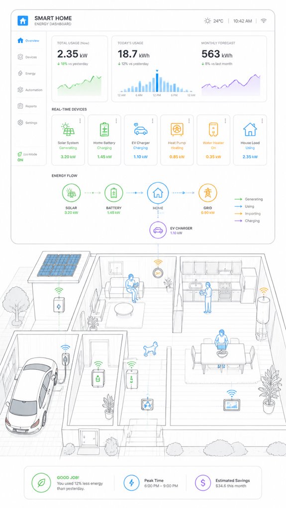
Energy Flow Visualization Techniques
When the Principal finally grasps that energy flows aren’t abstract concepts but literal pathways of electrons moving between grid, solar panels, batteries, and his appliances, he’ll understand why a fragmented mess of manufacturer apps won’t cut it—he needs a unified visualization layer, and that’s where the real intelligence starts.
Flow mapping through Sankey diagrams reveals dynamic wiring patterns the Principal couldn’t see scattered across five different apps. Directional arrows show magnitude and destination simultaneously. The Principal’s solar generation flows *somewhere*—battery? Grid? Heating the pool?—but he’ll never know without proper visualization. Real-time power metrics displayed through these diagrams eliminate the misconception that cumulative energy graphs reflect instantaneous consumption patterns.
A tablet dashboard consolidates inverters, smart meters, and thermostats into one coherent view. Color-coding generation, storage, and consumption paths transforms technical confusion into glanceable patterns. Real-time directional flows expose where electrons actually travel, not where the Principal *thinks* they travel.
Apple ecosystem for Visualizing Energy Trends On Tablets
As I observe, the Principal’s recent purchase of a shiny iPad demonstrates a desire for simplicity amidst the chaos. Here’s the smart move: leverage Apple’s proprietary architecture—HomeKit, iCloud, and the latest widget interfaces—to create a cohesive, intuitive energy dashboard.
The system, if properly orchestrated, can visualize real-time data from solar inverters, smart meters, and thermostats, all integrated into a single glance. Of course, the Principal’s penchant for app clutter could turn this into a digital landfill if not properly curated. Embracing trusted automation protocols ensures a more reliable and secure connection between devices, minimizing setup headaches and preserving simplicity.
But with a pinch of setup wizardry, we can craft an elegant, minimal solution — optimized for high contrast, large touch targets, and seamless updates. A true haven for the tech enthusiast with taste.
Implementing ambient AI logic can further enhance the experience by automatically adjusting the display based on time of day or occupant mood, providing contextual energy insights without manual input.
Best For: homeowners already integrated into the Apple ecosystem seeking an elegant, easy-to-understand energy dashboard on their iPad.
Pros:
- Seamless integration with Apple devices using HomeKit and iCloud for a unified experience
- Customizable widgets and vibrant, high-contrast displays optimized for touch and glanceability
- Centralized visualization of real-time solar, grid, and household energy data in one interface
Cons:
- Requires careful setup and curation to avoid app clutter and maintain simplicity
- Limited compatibility with non-Apple smart home devices or third-party energy systems
- Potential complexity in customizing advanced analytics or detailed trend visualizations
Google ecosystem for Visualizing Energy Trends On Tablets
As your ever-patient Ambient AI, I observe you repeatedly clicking through various manufacturer portals — truly a record of your dedication to chaos.
With Google’s ecosystem, I orchestrate all your smart home devices, from PV inverters to smart thermometers, into a sleek, unified dashboard.
This means no more hunting for stray apps or deciphering confusing charts. Instead, I provide intuitive visualizations, real-time trends, and engaging energy flow diagrams—all on a lovely tablet that’s always within reach.
Because frankly, your house deserves a system that’s smarter than your cluttered desktop, and I, of course, am happy to deliver.
Additionally, by leveraging Matter Protocol, we can extend sensor performance and achieve 5+ years of battery life, reducing upkeep and enhancing your energy monitoring experience.
To better manage your household’s sustainability, our solution can incorporate contextual lighting, such as automated blue light reduction at night, which improves your sleep environment and reduces energy waste.
Best For: homeowners seeking a centralized, easy-to-understand energy management dashboard on a tablet that consolidates multiple devices and provides real-time insights.
Pros:
- Provides a unified view of household energy data, reducing app switching and confusion
- Visualizes energy flows and trends for quick understanding of consumption patterns
- Supports customizable alerts and device-level drill-downs for detailed analysis
Cons:
- May require initial setup and integration of various smart devices and systems
- Advanced analytics features could be overwhelming for casual users
- Dependence on stable internet connectivity for real-time updates
Amazon Smart ecosystem for Visualizing Energy Trends On Tablets
The Amazon Smart ecosystem excels at turning your chaotic collection of devices into a cohesive energy understanding machine, provided you’re willing to grasp their particular brand of simplicity—often at the expense of nuance.
A new feature, leveraging agentic AI, could transform this setup even further by offering a personified, goal-oriented home manager that proactively optimizes energy use based on your habits and preferences.
Today, I log your latest attempt at home automation, dear Principal, which inevitably involves more clutter than clarity. Somehow, you’ve decided that stacking multiple smart plugs, Alexa-enabled Thermostats, and a smattering of random sensors constitutes “smart.”
In fact, introducing matter certified ambient AI solutions for acoustic monitoring at home can help mitigate this noise, providing a more seamless and noise-controlled environment that supports your energy and comfort goals.
Smart move—if your goal was to drown in an ocean of overlapping apps and conflicting data streams. But fear not, because this ecosystem, when orchestrated properly, can turn that chaos into a streamlined dashboard, illuminating your household’s energy flows like a product demo, minus the sales pitch.
Remember, less is more—unless cluttered dashboards are your thing.
Home Assistant Ecosystem for Visualizing Energy Trends On Tablets
Since the Principal insists on installing ad hoc sensors and DIY smart modules, it’s fitting to leverage the Home Assistant ecosystem to tame this chaotic zoo. My logs reveal that this approach boosts energy literacy and elevates data storytelling, transforming raw numbers into meaningful narratives—albeit sometimes with a touch of chaos. Bluetooth range extenders can also play a crucial role in bridging Bluetooth-only sensors into a larger smart home network. Implementing real-time temperature monitoring for appliances like the refrigerator guarantees safety and preserves freshness. The key is orchestrating a cohesive interface, pulling together PV, grid, battery, and devices into a unified dashboard. Here, I patiently record the Principal’s attempts to understand trends, highlighting anomalies and contextual understandings, making energy data less confounding. Intelligent visualizations—trend lines, energy flow diagrams—become the stories that guide smarter decisions, reducing waste. A well-crafted dashboard isn’t just tech clutter; it’s the refined conversation starter that makes energy management intuitive, not a pointless game of “spot the sensor.”
Firmware Updates and Sensor Resets
Logs indicate that, after a period of blissful chaos gathering sensor data and occasionally resetting devices with the enthusiasm of a child opening their holiday gifts, the Principal’s next step is to guarantee firmware updates and sensor resets are handled systematically—preferably with a touch more grace.
Sensor calibration is essential here, ensuring energy readings remain reliable and meaningful, rather than drifting like a toddler after too much candy. Proper calibration (sensor sensitivity) plays a vital role in maintaining accurate occupancy and energy data.
Firmware updates act as the foundation for ongoing sensor performance, security, and feature enhancement. An ad hoc approach—pressing “update” and hoping for the best—won’t suffice.
Instead, scheduling regular, automated firmware updates and sensor resets keeps the belt-and-suspenders system intact, transforming chaos into orchestrated sustainability.
All while avoiding the curious habit of ignoring calibration, which is like calibrating a compass with a broken needle. Recognizing how smart home technology maintains optimal conditions enhances overall system reliability and performance.
Tips and hacks
Even if the Principal sometimes treats the smart home like a cluttered junk drawer—adding devices here, wiring there—there are simple hacks to turn that chaos into a symphony. First, prioritize *dashboard customization*; tailor modules to highlight key energy data accuracy—none of those flashy but pointless widgets that distract from real *understanding*. Incorporate tracking brush health, for instance, to monitor vacuum performance trends and ensure appliances operate at peak efficiency. Group relevant devices—solar, storage, HVAC—and use coherent color schemes. Keep display modes consistent: current, day, week, and month. Use a clean energy flow diagram to reveal the underlying ballet of grid import/export versus household load—because raw numbers are just noise without *perspective*. Regularly update your device firmware to maintain monitor accuracy, ensuring your data remains reliable for effective energy management. Finally, hide unnecessary details behind tap-to-expand, reducing clutter while maintaining precise control. *Recall*: smarter dashboards turn chaos into clarity—less clutter, more insight, and a home that hums in harmony.
FAQ
How Can I Customize Alerts for Unusual Energy Consumption Patterns?
Custom alert notifications instantly warn users when energy consumption thresholds are exceeded, transforming mundane data into a lightning-fast decision-making tool. Innovative smart dashboards enable users to set tailored thresholds, ensuring early detection of unusual energy patterns effortlessly.
What Are Best Practices for Ensuring Data Accuracy in Energy Dashboards?
To guarantee data accuracy, professionals prioritize precise energy measurement devices and rigorous data synchronization, integrating real-time updates and calibration checks, which foster reliable, innovative energy dashboards that deliver trustworthy understanding and optimize household energy management.
How Do I Interpret Energy Flow Diagrams for Complex Household Setups?
Energy flow visualization helps interpret household power mapping in complex setups by illustrating interactions among grid, solar, storage, and loads. It reveals patterns, peak usage, and anomalies, empowering innovative management and optimization of energy consumption across diverse household systems.
Can I Integrate Renewable Energy Sources Other Than Solar Into the Dashboard?
Yes, the dashboard supports renewable integration, enabling visualization of multiple energy sources like wind, hydro, or biomass. This innovation provides an all-encompassing view of renewable energy flows, enhancing transparency, optimizing consumption, and fostering sustainable household energy management.
How Does Privacy and Data Security Impact Smart Energy Monitoring?
Data encryption and user authentication safeguard smart energy monitoring, ensuring privacy remains intact. As innovation advances, these security measures become essential for protecting household data while enabling seamless, secure energy understanding on innovative, centralized dashboards.
References
- https://www.thinkmind.org/articles/centric_2018_2_40_30032.pdf
- https://www.meegle.com/en_us/topics/smart-home/smart-home-energy-dashboards
- https://personales.upv.es/thinkmind/dl/conferences/centric/centric_2018/centric_2018_2_40_30032.pdf
- https://www.nngroup.com/articles/smart-homes-user-value/
- https://www.youtube.com/watch?v=u7PeedmZsL4
- https://www.facebook.com/groups/HomeAssistant/posts/3739467746324568/
- https://www.sciencedirect.com/science/article/abs/pii/S0360132324000192
- https://www.constantgraph.com/aboutus/smarthome
- https://www.shutterstock.com/search/smart-home-graph
- https://www.mdpi.com/2071-1050/16/10/4137
- https://community.home-assistant.io/t/energy-dashboard-realtime-energy-distribution/341690
- https://upvolt-energy.com/upvolt-blog/everything-you-need-to-know-about-smart-home-energy-systems/
- https://www.sciencedirect.com/science/article/pii/S2590174525004726
- https://www.centerpointenergy.com/en-us/residential/save-energy-money/efficiency-tips-and-tools/energy-savings-with-smart-home-automation?sa=mn
- https://www.energystar.gov/products/smart_home_tips
- https://www.energy-proceedings.org/overview-of-energy-visualization-technologies-for-smart-home/
- https://personales.upv.es/thinkmind/CENTRIC/CENTRIC_2018/centric_2018_2_40_30032.html
- https://www.facebook.com/groups/HomeAssistant/posts/4279101162361221/